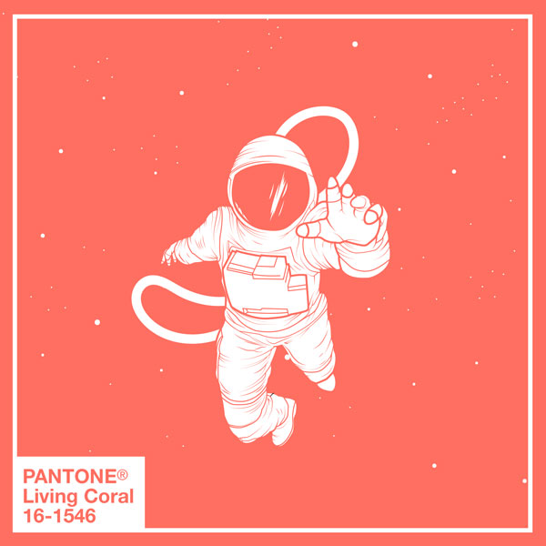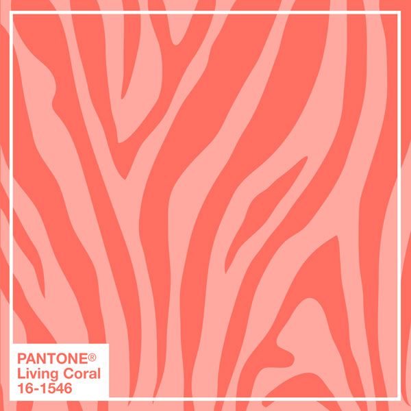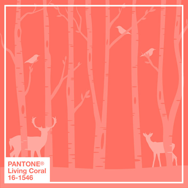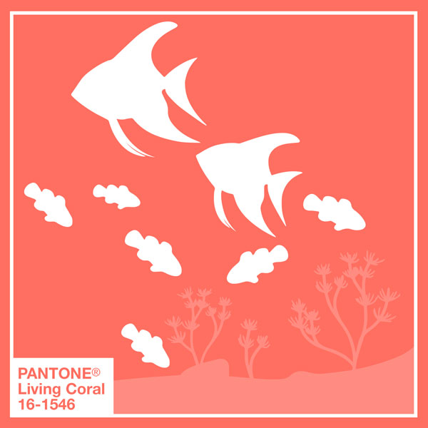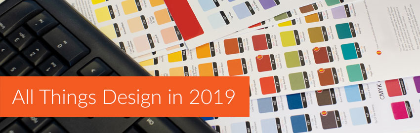
Pink is in vogue. Or rather, a particular ‘hue’ of pinky orange. Pink isn’t a colour you would normally associate with colour of the year, but alter the hue, give it the name ‘Living Coral’ and it becomes an entirely different proposition. "It represents a feeling that’s out there in the zeitgeist," says Leatrice Eiseman, executive director of the Pantone Color Institute. And he would say this, having travelled, interviewed and researched for the year leading up to this award. Inspired by the warm terracotta of a Tunisian sunset, or the vibrancy of salmon pink flamingo, this is a warm almost playful colour. Love it or loathe it, this bold colour is set to find its way into more design work in the year ahead.
Find out more about the Pantone Colour of the Year
We asked Dave Davies from our Web Design Department if a single colour has the power to influence a company’s design choices. We also wanted to find out from Rank Your Domain’s Design Department where they can see design trends heading in 2019.
"Similar to the Ultra Violet choice of 2018, I can understand the reasoning behind this choice of colour. A bold colour like ‘Living Coral’ will help companies stand out in the marketplace. But of course, design is about suitability and not every company is going to rush to bring this colour into the palette. But a trend we are continuing to see is the use of more vivid colour combinations to make designs stand out more. The addition of intense hues of blue, yellow, pink and red for example, can really help to attract the attention of your audience."
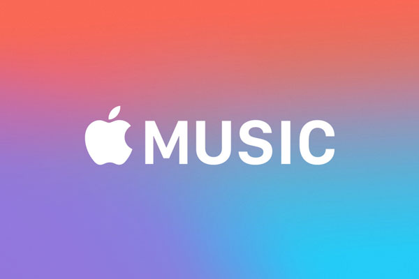
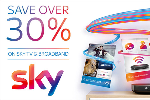
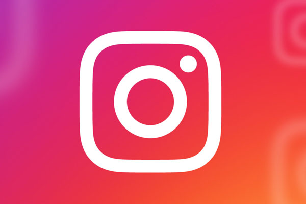
"If you go one step further and create gradients using bold colours, then you are starting to widen the palette and this brings another layer or depth to your design work. If you look to brand names such as Apple, Sky and Instagram, this gradient approach either for the foreground logo or background is being widely employed. For businesses, this is definitely worth considering."
"Pantone has had an importance in design work for as long as I can remember. The reason we use Pantone colours, as opposed to any made up colour, is that it guarantees a consistency that you can mirror across print, web and screen. Consistency is a big part of our work. If you think of those famous brands, you don’t automatically think of their colour, well you might, but it is safe to say if you saw a print error that resulted in a hue change, you would quickly think something wasn’t quite right and that would become a focus, so it’s a detail you have to get right. We also recognise the time and effort that has gone into choosing a colour, so, as a designer you have to respect that."
"The importance of colour can’t be overstated, and there are quite a few free to use resources involving colour around the web to help choose a palette that works for you and your business."
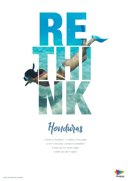
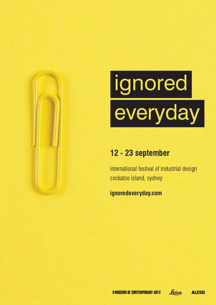
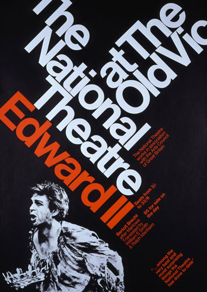
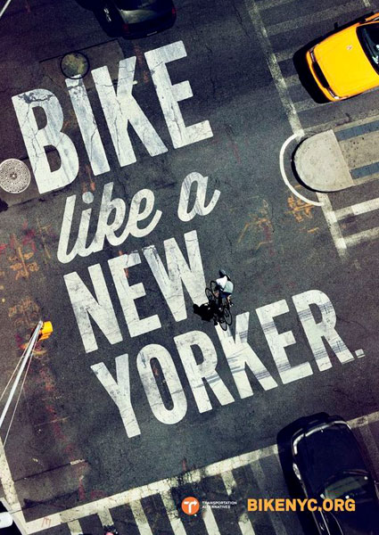
Colour is crucial to any design and when coupled with typography the end result really starts to take shape. Design trends have a habit of being recycled and at the moment, it’s the big bold fonts that are dominating design and advertising. The key to using this style of font is getting smart or minimalist with other elements around the main text area. This ensures the design doesn’t become overcrowded.
Text on background boxes is likely to be among the graphic design trends in 2019. This retro inspired look can help to give designs more of an edgy appearance and will work well combined with other trends such as bold colours.
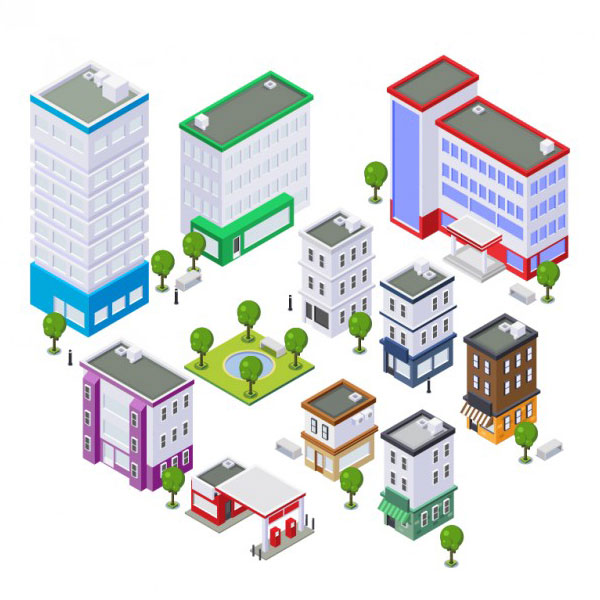
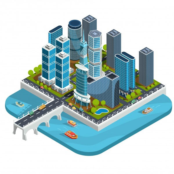
"Another interesting trend is Isometric Design, a great method for drawing 3D objects in 2D. It is quite a specialist technique but is a style that has been used more and more over the last year or so and I believe will continue in 2019. This style is simple and clean looking but helps give flat designs more of a lift."
"A big aspect of design is imaging. When you flick through the pages of stock libraries there are thousands of images that may at first look natural, but when you start to look closer, some of them look slightly overly staged or ‘emotionally charged’. Customers are quite savvy and can spot a staged image a mile off. So designers are opting for photography that is either shot specially or images that have a subtle, natural feel."

Graphic Designer
Dave has been with us since 2012 and brings years of experience as a talented graphic designer as well as an innate understanding of usability and web layout. Having a strong understanding of what clients wish to achieve in both marketing performance and usability for websites, Dave is great at both communication and application alike.

Content Creator
Nick has worked in Imaging for most of his life. His work has been seen in print, TV and video for (among others) Co-op, Canon, London Zoo, Rolls Royce, IBM, Explore Travel and various county councils. Nick specialises in people, product, food and travel and has followed the IT and camera industries closely.


 ISO 27001
 ISO 9001
 ISO 13485
 ISO 14001