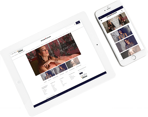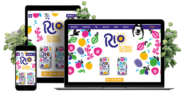
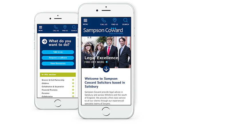
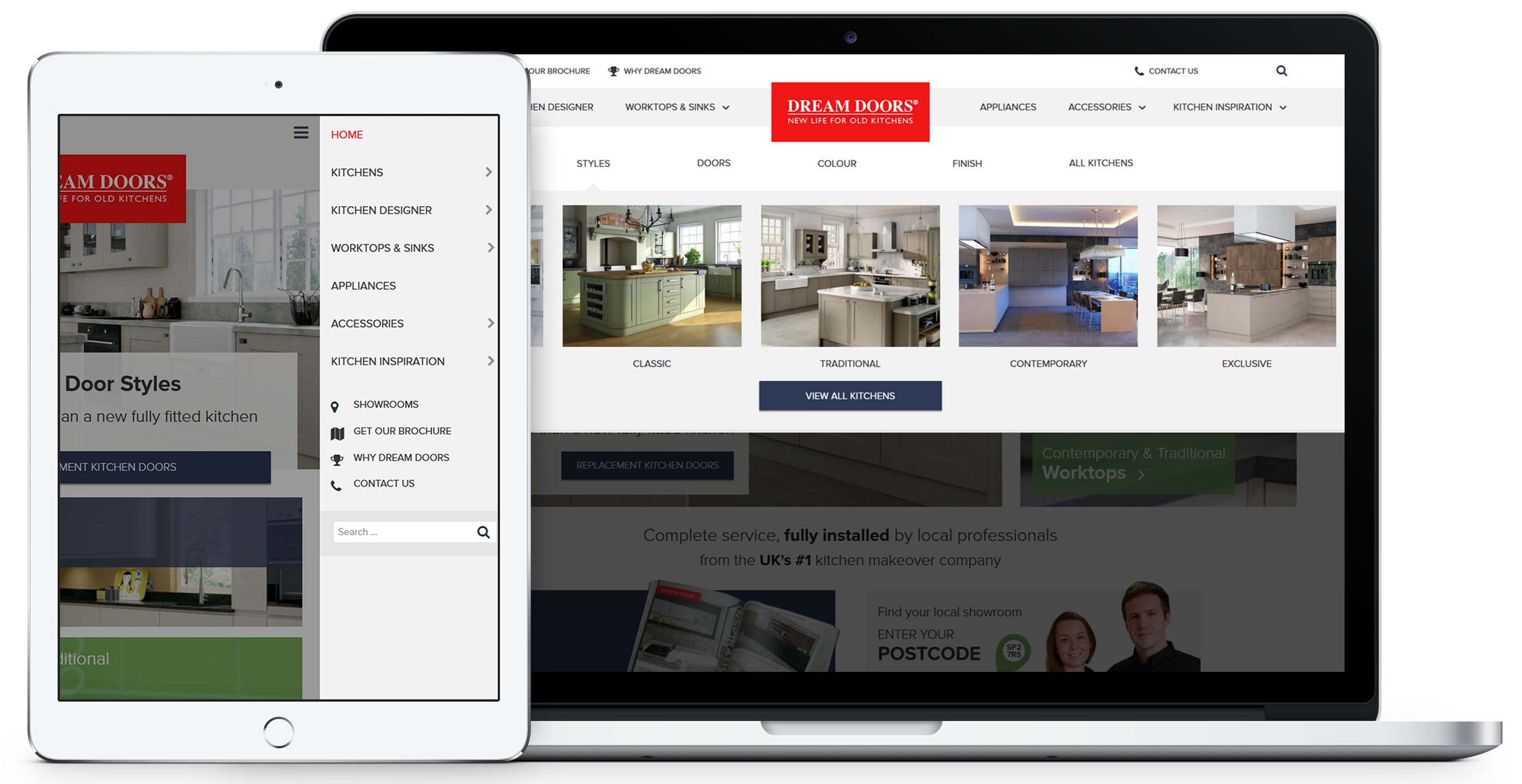
It almost goes without saying that a modern website needs to be responsive. If you want your business to have a digital presence then you need to make sure that users can get the full experience on mobile, tablet and desktop.
Mobile phones are the most popular devices to use and desktops come in at a close second, so you’ll want a site that’s usable and scalable for the various screen sizes and browsers that are available. Your users are your #1 priority, so it’s essential that you make sure that they’ve got a consistent experience no matter what device they use.
That’s what we do. We design sites with the user in mind. And as mobile-friendly sites are a must-have, we plan how your site will look on a mobile from the start. Our designers know their stuff, they’ll build your website to be responsive and test it to make sure that it works. We’ve designed hundreds of responsive websites and we’ll build a high-quality, professional site that makes your business look great.

Charlotte
Senior Web Designer

A mobile site has to engage users at the first possible chance while, at the same time, delivering the same content a desktop user would see; anything that’s hard to navigate or slow to load will cause abandonment.

Design that responds and adapts itself for optimal viewing on multiple devices, like desktops, tablets and mobiles.
We run our projects using an accredited quality management system and our QA team will test the site on multiple screen sizes, devices and browsers.
Keep your site looking great and create a consistent user journey across all devices.
A fully functional and easy to use responsive design will help make your business look modern and professional in the online marketplace.
User friendly and mobile friendly CMS - The platform millions of websites are built with.
Modern websites are designed and built around a content management system.
Our knowledge in usability, accessibility and visual design will enhance the experience of your users.


 ISO 27001
 ISO 9001
 ISO 13485
 ISO 14001