
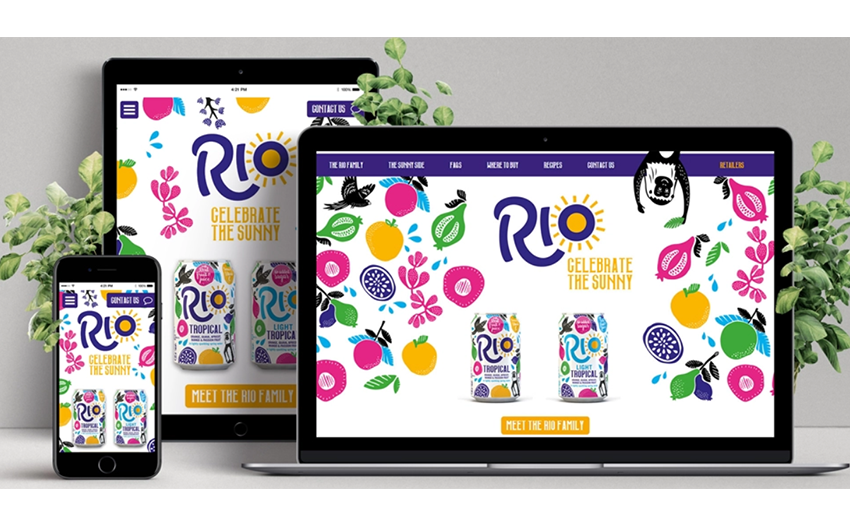
Now, more than ever before, we use our smart phones to search online as it's convenient to have everything in the palm of our hands, whether that's buying gifts online, looking for your next holiday or simply surfing the net. With mobile traffic now accounting for over 50% of users, it is really essential to have a responsive web design which adapts to the size of the screen it is being displayed on. A responsive website design means that a website (and its functions) can adapt to deliver the best experience to users, not just in terms of user-friendliness but also aesthetic qualities.
Creating new websites to fit every resolution and every device would be unsustainable if you were to do it using a different design and development phase for each new gadget on the market.
A responsive website design uses a mix of flexible grids and layouts, and relies on the intelligent use of CSS media queries. When the user switches from their laptop to a mobile phone, the website automatically adapts to accommodate for the new resolution, image size and scripting abilities. A responsive website design aims to provide the website with the ability to automatically respond to the user’s environment.
As mentioned before, it is no longer enough to create a web design suitable for just one device. The latest statistics show 57.34%[1] of users access websites through their phones. If most of your visitors use their mobiles to browse through your site and it is not web responsive, you risk losing them because of a poorer user experience.

A responsive web design will help you avoid:
From a web developer standpoint, this approach saves both time and money.
To create a responsive CSS you will need to:
You can use a pre-designed theme or layout to save time, however, this means you will have to make sacrifices with your branding and creativity.
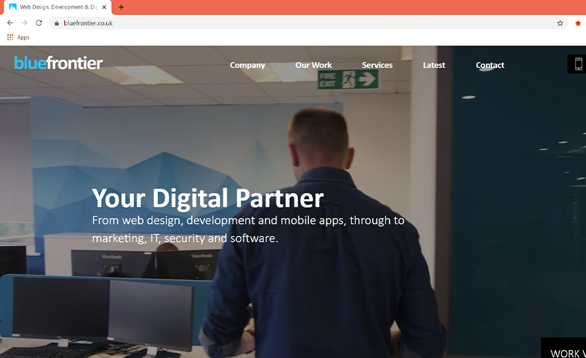
Open the site you want to test in a Google Chrome tab. We will be using our own site for this example.
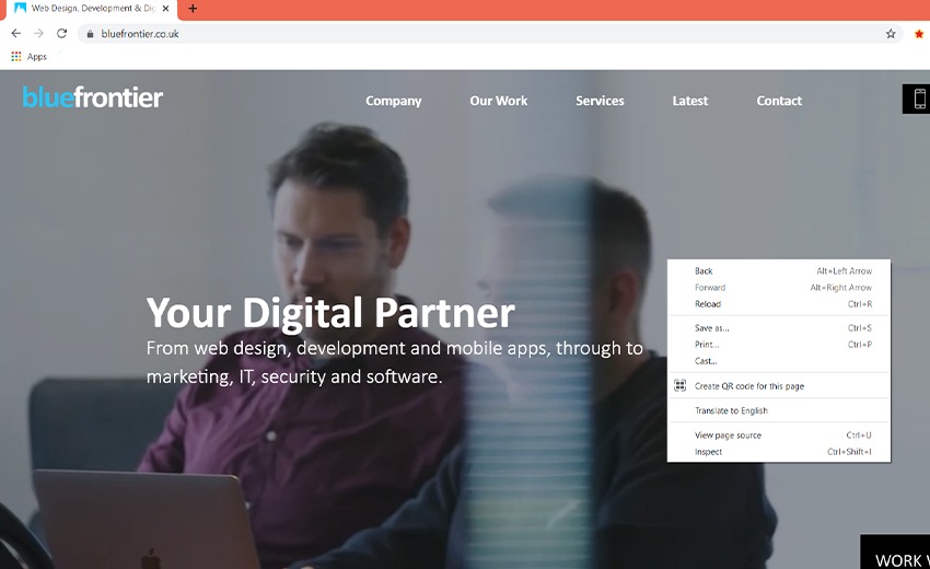
Right-click on the landing page of the website to open the options menu. Select "Inspect" from the menu.
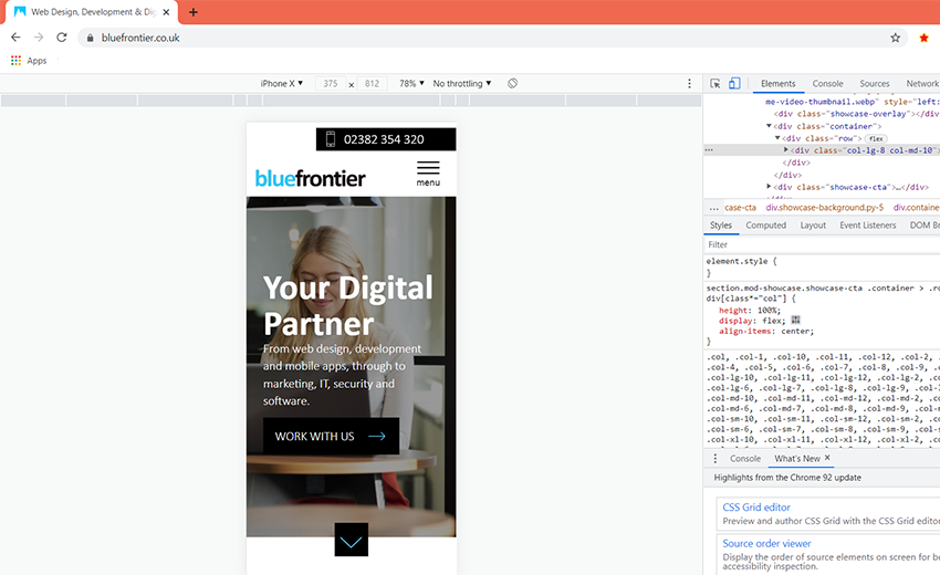
Click on the "Toggle device toolbar." Below we showed where this button is located.

You can see if your site is adaptive for other devices and how it will look.
With responsive web design, you can make sure your website looks great on any screen, be it on a mobile phone, tablet, laptop or desktop. Users expect nothing less from websites or they will soon leave and look elsewhere, which means it is essential that your site is responsive to remain competitive.
We understand that not everyone has a team of web developers and designers at their disposal, which is why our dedicated team is available to you create responsive designs that look great and are easy to navigate, no matter what device the user is on. Our test team can run in-depth tests on your site to make sure it runs well on all devices and provide recommendations.
Get in touch to find out how we can help.
[1] statcounter.(2021). Desktop vs Mobile Market Share Worldwide. [online].gs.statcounter.com. Available at: https://gs.statcounter.com/platform-market-share/desktop-mobile/worldwide/#monthly-201107-202107 [Accessed 23/08/2021]

Digital Marketing Executive
Wiktoria lives to create, she is a marketing postgraduate who loves social media and content creation. Customer satisfaction and driving engagement is at the heart of her work. She has worked with different clients including fintechs, affiliate marketing agencies and NGOs for over 3 years to grow their brands, as well as provide them with original and creative content. Since joining Rank Your Domain, Tori has focused on content creation and social media marketing.


 ISO 27001
 ISO 9001
 ISO 13485
 ISO 14001